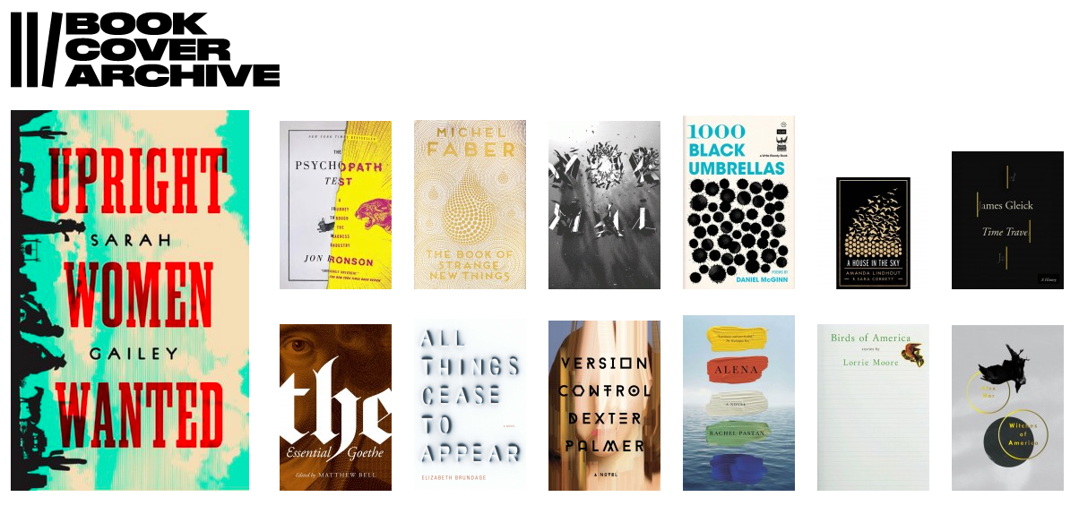
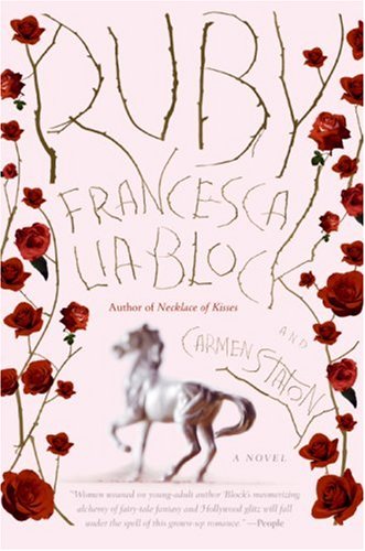
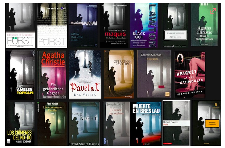
This post it not a how-to. No primer, no matter how comprehensive, can teach the know-it-when-you-see-it quality that catapults an everyday shelf-piece into the realm of book art.
The Peter Mendelsund-designed Ulysses (as well as Dubliners and Portrait of the Artist as a Young Man), provides a startlingly effective illustration. Here is style and savvy in spades. But here, too, is the kind of entrainment between writer, reader, and designer that channels a book’s essence.
In The Wave and the Mind, Ursula Le Guin describes entrainment as the tendency for two wall-mounted clock pendulums to slowly swing in sync. Physicists call this “mutual phase-locking”; Le Guin describes it as the “beautiful economical laziness” by which successful relationships are formed.
It’s all a little spectral, but this (2013) Ulysses cover illustrates the certain quiescence by which a design imparts the spirit of a story. What looks like boldly scribbled marginalia interrupts but also completes the title with the “yes” acknowledging the book’s last—and now first—word and its (arguably) most famous line: “yes I said yes I will Yes.”
While this isn’t a how-to, it does offer an injunction: When approaching book cover design, find inspiration in books that illustrate style, savvy, and this kind of economical soul. Then, aim that high.
Back when my readerly tastes were driven by the limited options at my suburb’s small, strip mall-located library, I rarely chose my books by their covers. Most of the library books sported dogeared, aggressively stickered covers anyway, so my appreciation for a cover’s import remained stunted.
It wasn’t until I arrived at college and received a syllabus that included Jean Rhys’s Wide Sargasso Sea that a book cover swept me up in a passionate embrace. I had read Wide Sargasso Sea before (an excellent companion to Jane Eyre), but my copy was library-bound and looked like this:
The copy I purchased at the university bookstore looked…different:
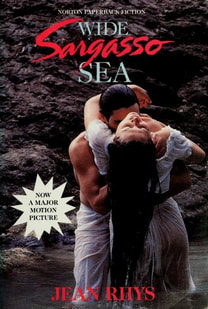
The newer cover doesn’t say “post-colonial prequel” so much as “hot, sexy movie tie-ins!” And it certainly captured my attention. How did my first reading miss all that under-the-waterfall lovemaking?
While the wet, white-hot muscly embrace bears a mostly fantasy-based relationship to the book, the cover makes a potent play for reader’s eyeballs. This is the point of all book covers…although some achieve their aims more thoughtfully and cleverly than others.
But what makes for a thoughtful, clever book cover? One that captures readers with style that is inspired by and germane to the story between the covers? There’s a lot to consider—we’ll cover some of it in a coming post.

